

Get visitors to convert. Get them to fill out a form.
It’s a permanent mantra in my head.
As a marketer, I’m obsessed with converting a visitor into a contact and turning them into a qualified lead. Marketing strategies need to demonstrate a return on marketing investment and result in a positive business outcome after all.
Lead generation forms on properly optimized landing pages are the cornerstone to digital lead generation.
Companies see a 55% increase in leads when increasing their number of landing pages from 10 to 15.
Increase the number of landing pages to 40 or more get 12 times more leads than those with 5 or less, according to HubSpot.
Once you’ve crafted an attractive offer, a landing page acts as your elevator pitch – detailing the benefits a visitor will receive if they trade their information by filling out the lead generation form.
To make sure your landing page forms convert visitors into leads, it’s crucial that the form is optimized. Read on to learn the 4 lead generation rules you shouldn’t break.
 You might be wondering how much or how little information you should require with a form. The fewer fields you have in a form, the more likely you will receive more conversions. This is because with each new field you add to a form, it creates friction (more work for the visitor) and fewer conversions. A longer form looks like more work and sometimes it will be avoided altogether. On the other hand, the more fields you require, the better quality those leads might be.
There is no magic answer when it comes to how many fields your form should contain but the industry baseline is somewhere between three and seven fields on a landing page form. According to Eloqua, there is a pretty significant dropoff in overall conversion rates after both three and seven fields. The best way to determine what works best is to test it.
 That is the question most of your visitors are asking. One of the best ways to increase form conversion rates is to simply NOT use the default word “SUBMIT” on your CTA button, according to HubSpot.
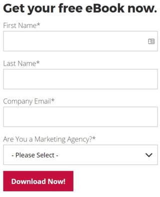
If you think about it, no one wants to “submit” to anything. Instead, turn the statement into a benefit that relates to what they are getting in return. For example, if the form is to download a brochure kit, the submit button should say, “Get Your Brochure Kit.” Other examples include “Download white paper,” “Get your free eBook” or “Join our Newsletter.”
Another helpful tip is to make the button big, bold and colorful. Make sure it looks like a button (usually beveled and appears “clickable”).
People are more resistant to giving up their information these days, especially because of the increase in spam. There are a few different elements you can add to the form or landing page to help reduce a visitor’s anxiety about completing the form:
Sometimes people won’t fill out a form just because it “looks” long and time-consuming. If your form requires a lot of fields, try making the form look shorter by adjusting the styling.
For example, reduce the spacing in between fields or align the titles to the left of each field instead of above it so that the form appears shorter. If the form covers less space on the page, it may seem as if you’re asking for less.
Knowing how to optimize the lead generation forms on your landing pages will help you convert more visitors into leads. To learn more about lead generation tactics, download J&C’s free eBook, “30 Greatest Lead Generation Tips, Tricks and Ideas.”

Topics: Digital Marketing