

Henry David Thoreau said we need to "simplify" over 150 years ago...
And it's still just as true today.
Especially in the world of direct mail design.
Because direct mail design, much like digital design, has been changing over the years.
Today we are seeing simpler designs… more infographics… better data visualizations, etc. And you don’t have to search very long or hard to see how designers are learning from each other. Direct mail designers are using some of the same techniques and ideas as their email, digital display, and website designer counterparts.
As a result, we see fewer full-color photographs in our daily direct mail. In their place are simple line drawings, flat art illustrations and icons — all of which are easier to produce and easier to customize with your corporate colors scheme. On top of that, this style of artwork is readily available from a multitude of stock art vendors. Another advantage is that you’re less likely to use the exact same stock icon as your competitors in the same category (we’ve all seen that happen with stock images and it’s cringeworthy).
Another area where we see “simplicity” in action is the use of ample white space throughout the direct mail package. Yes, today’s higher production and paper costs mean that this it is quite inefficient. These days, the pure economics of a campaign compel us to not leave one square inch of our direct mail real estate “unused.” However, today prospects and customers are accustomed to seeing lots of white space on pages, sites, and other digital channels they browse. So seeing it in their direct mail seems familiar and inviting. And after much testing, we know that using white space wisely provides a cleaner, more contemporary look, works better and is easier to navigate than an overcrowded, cluttered, or busy layout. And for the reader, a clean “open” design makes it easier to comprehend the offer (better signal-to-noise ratio), and understand how to respond to it. And as always, in direct mail, whatever generates the best response rate — WINS.
Let’s take a closer look at how that plays out in one particular industry — insurance.
Insurance is one of the more heavily regulated categories in business. Over the years, insurance companies have found direct mail to be a worthy communications channel. It continues to outperform every other channel, including email and digital channels in terms of response rates.
At the same time, insurance products can be quite complex. They often require both selling skill and thoroughness to clearly explain the various coverages and benefits being offered. Some types of insurance require that consumers speak with a licensed agent before they can purchase a policy. Therefore, many insurance direct mail campaigns drive customers to a toll-free 800 number to respond. This makes the need for a response device BRC and a BRE superfluous.
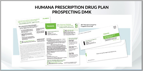
The creative (below) for the Humana Medicare Prescription Drug Plan proved to be an extremely effective package. It featured an official-looking #10 envelope with a double-window and personalized teaser copy. A hyper-personalized letter is the only other component in this package.
That letter uses short, direct copy. This helps reduce the complex information to just the most salient points. Bold subheads, bulleted lists and clear calls-to-action makes it easy for the reader to scan and digest the pertinent information quickly. The copy also gives readers a clear path to respond.
You’ll also notice the prescription medicine bottle icon and mobile phone icon. These simple line art illustrations helped increase engagement and were featured in a package that performed significantly better than the previous campaign.
So will this “less is more” trend continue? Is it here to stay? Well, they say the average person’s attention span is shrinking. And everywhere you look, you see more and more ads from more and more advertisers in more and more unique places (been to the restroom in a restaurant lately?)
As marketers, we have only a few seconds to get our message across. Certainly, a simpler layout and design help facilitate that. Shorter, to-the-point copy helps, too. But there’s an old saying in advertising that goes something like this: “People don’t read advertising, they read what interests them, and sometimes that’s advertising.”
That’s as true as the Thoreau quote we started with. If your prospect or customer is truly interested in what you have to say, they’ll be hungry for every bit of information you have. But that doesn’t mean you can drone on about it or repeat yourself or clutter the page with irrelevant images. On the contrary, if you have something interesting to say, say it quickly, clearly, and completely, but say only as much as you need to about it.
Ok, so then the question become, how long is that? How long is too long? You can check out this blog for an in-depth discussion on long vs. short copy. But another advertising aphorism may help you zero in on the perfect length of your next direct mail piece — and it goes like this: once the prospect is sold, stop selling. If you can make your case in one sentence, great. If you need a page, take it, if you need five pages to explain every benefit and answer every question the prospect is likely to have, take them. Remember if it interests them, they’ll read it. But keep it clean, keep it simple — and keep it interesting.
Simple is not boring.
And simple is not easy.
At J&C, our expertise lies in our mastery of the art and science of customer engagement. Helping clients improve their response rates and marketing ROI is our specialty. Contact J&C today if you need help getting a simpler, cleaner, clearer message to the right audience.
Topics: Direct Marketing, Direct Mail, Creative